One of our most challenging yet rewarding projects to date has been the Sydney warehouse. Our clients came to us with a brief to design and transform a run down inner city warehouse into a sophisticated elegant home.
Transforming a warehouse into a modern home while respecting the architectural heritage was the design challenge faced. We enhanced the architectural bones of the original building instead of concealing them. The scale of the design was important, ensuring it felt balanced and in harmony with the bones of the building and the new functionally as a family home.
We gave the home a very luxury feel, simple but sophisticated, allowing the quality of building materials to speak for themselves
We respectfully retained the beautiful feel of the era and the impact of living in a warehouse
From a blank canvas we designed the new layout from the ground up. The original ground floor consisted of a number of uneven terraced levels. To create a more fluid space we excavated over 12 truckloads of soil and old flooring structures to create a more user friendly space.
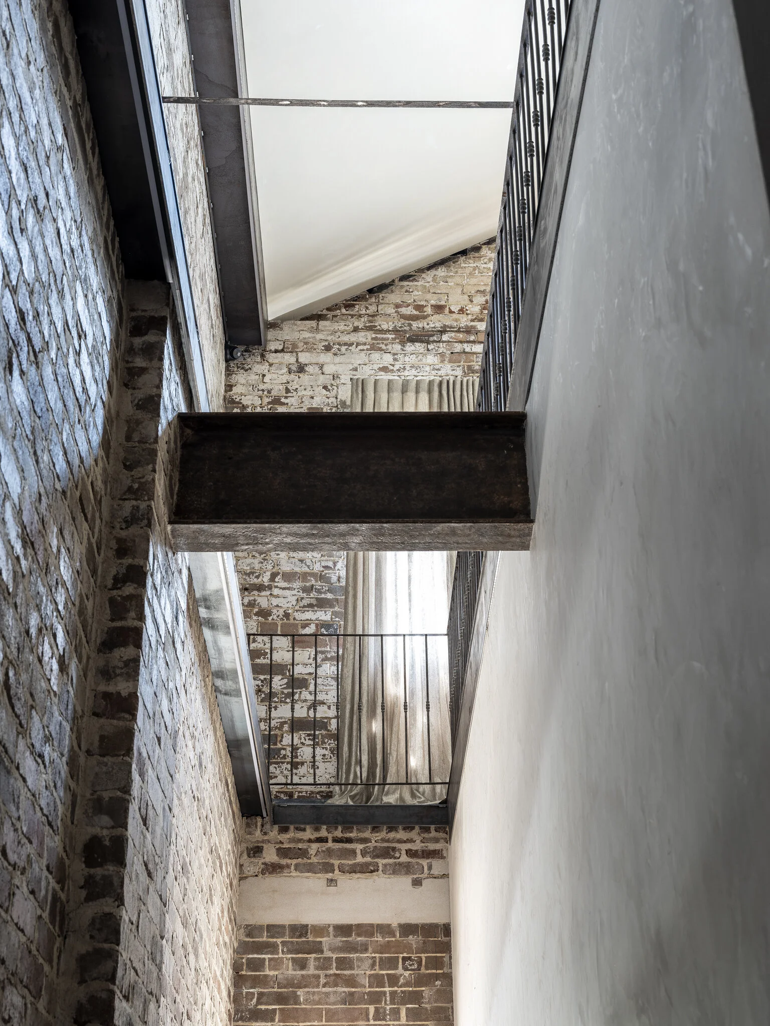
The ground floor now houses a striking entry hall underneath the original steel beams and opens to the welcoming and elegant main staircase.
“Walking into the home you are now greeted with a view to the upper level and can see the amazing historic exposed ceiling trusses and rafters.”
The original warehouse had a tiny, dark and very narrow staircase located right at the back of the block, to reach it you needed to walk almost 30m from the front door to access the upper level and it wasn’t practical for a home. To solve this layout problem we designed two huge access spaces, one at the front and one at the rear of the building, housing the two generously portioned staircases.
To be in balance with the scale of the warehouse surrounds and the large ground floor to roof height of over 10m, the new staircases needed to match the grandeur of the building. We increased the feeling of height and created light filled staircase voids.
Our team designed and hand crafted the staircases on site. We wanted the overall look of the bespoke staircase to be timber to bring a natural element to the industrial building, with such great spans of each tread we couldn’t achieve the look we were after in timber alone. For structural strength we designed laser cut steel staircase stringers, which were then cladded in beautiful 300 year European oak. The result is a seamless uncluttered timber staircase with a lovely balance of timber textures engineered with the strength of steel.
Natural tones and textures of brickwork and timbers harmonise with the character of the steel
The stairs case void allows natural light to flood the lower floors
Further down the hall is the luxurious master suite with his and her connecting en suites and walk in wardrobes. The ground floor also has two additional bedrooms, two bathrooms, and laundry. At the rear of the building tucked behind the second staircase is the library and cinema room.
Our team hand crafted the bespoke vanity bench tops is recycled timber
Natural stone is paired with patina brass tapware
An antique workbench was transformed into a bespoke bathroom vanity
“We designed the proportions of the ground floor rooms to be more intimate creating a feel of warmth and a contrast from the larger warehouse elements upstairs. ”
The second staircase is beautifully suspended from the brick walls.
The downstairs cinema room with cellar storage
The upstairs layout was designed to be in keeping with the traditional warehouse feel, with a large open plan living area, it is the main hub of the home. The huge space combines the kitchen, smaller butlers kitchen, dining and living areas all brought into one communal area.
“Attention to detail and our holistic approach to the project brings it to life. Everything was considered”
These steel pelmets were designed to fill the small void between the exposed brick and the roof as well as enclose the eternal box guttering. We designed these custom steel pelmets to integrate with the steel panels we used to strengthen the trusses. We selected steel instead of using plasterboard or timber to ensure it was in keeping with the industrial nature of the building. To enhance this element we ran LED lighting to shine down the original walls illuminating all the years of character.
“The steel design solution creates a seamless finish and a strong architectural element”
Original window voids draw you through to the barroom, an intimate area to retreat from the larger main living space.
“We respectfully retained the beautiful feel of the era and the impact of living in a warehouse”


