BERRY
After moving our family and business to Berry we then set our sights on looking for a unique property that ticked all the boxes for a renovation. After 25 years of building and designing over 100 luxury homes for clients, this time we wanted to be our own client. We found a 2-acre farm right in the heart of Berry. The existing house was a red weather board two story house with a red tin roof, it had been used as a BnB for many years and had 5 bedrooms all with ensuites, but the house had no living area and the kitchen was far to tiny to work with the number of people in the house. The layout was very dysfunctional; there was no way to fix it without adding an extension.
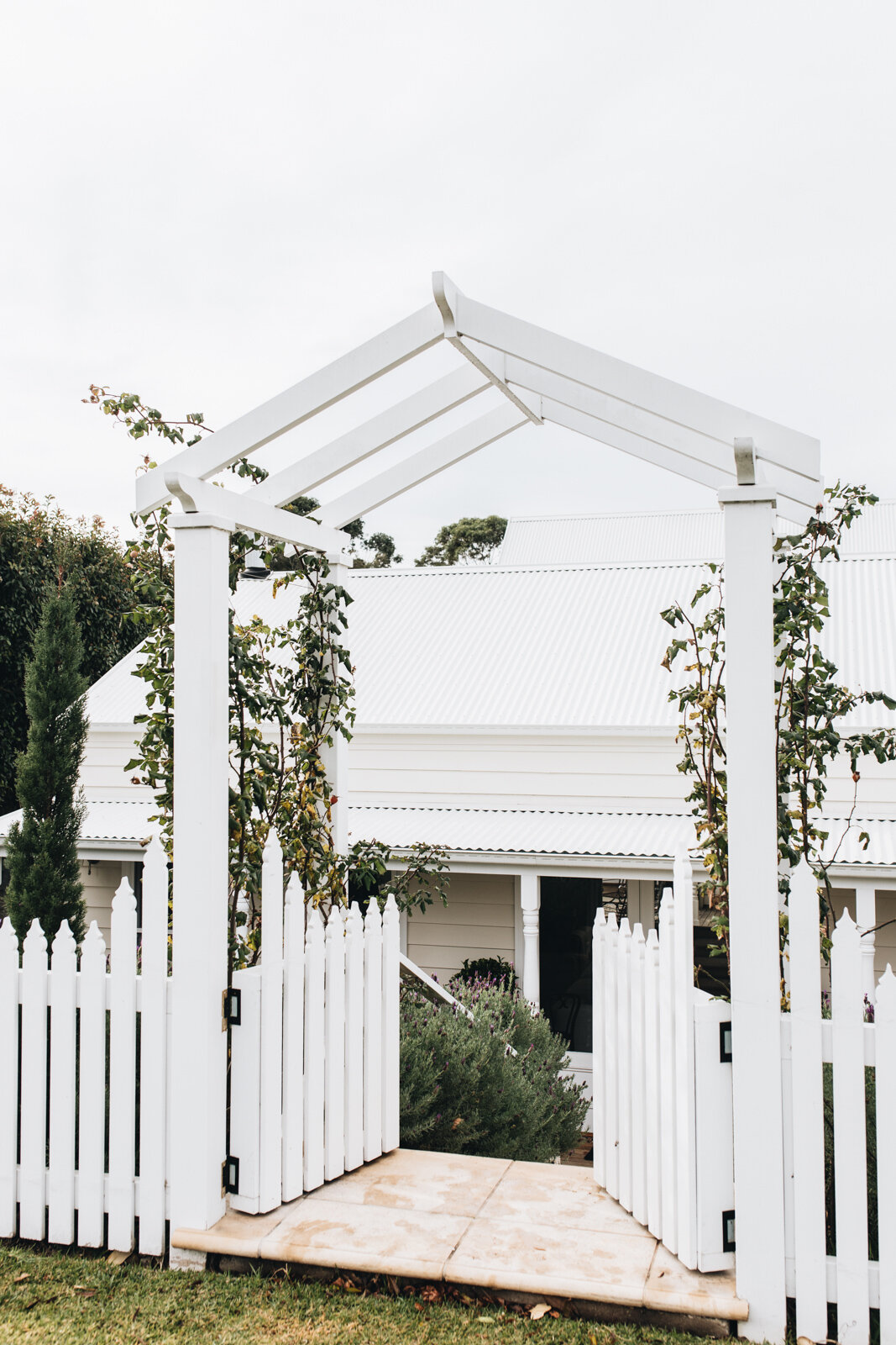
There were many design constraints on the land but Hilton saw the potential and knew he could design around the hurdles that the property held. Navigating flood zones and troublesome building exclusion lines were limiting how far we could extend in most directions. The new home encapsulates the charm of the surrounding Berry historic cottages. Hilton and his team transformed the house into something truly stunning.
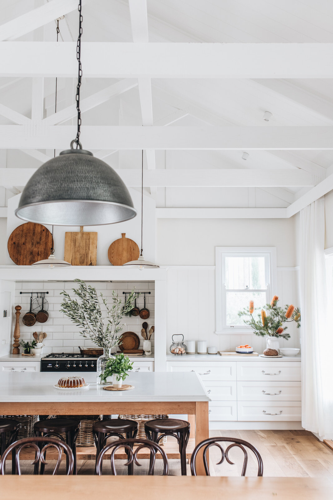
Hilton’s main objective in designing this space was to make it look and feel like an area for people to want to be in. A place to gather and entertain with family. A beautiful functional space that delivered more than just a place to cook and prepare meals, a space were everyone could be at the one time and share time together. And with more people in a space, everything has been designed with scale in mind, so its big, really big, yet still filled with the cosy character of a traditional farmhouse.
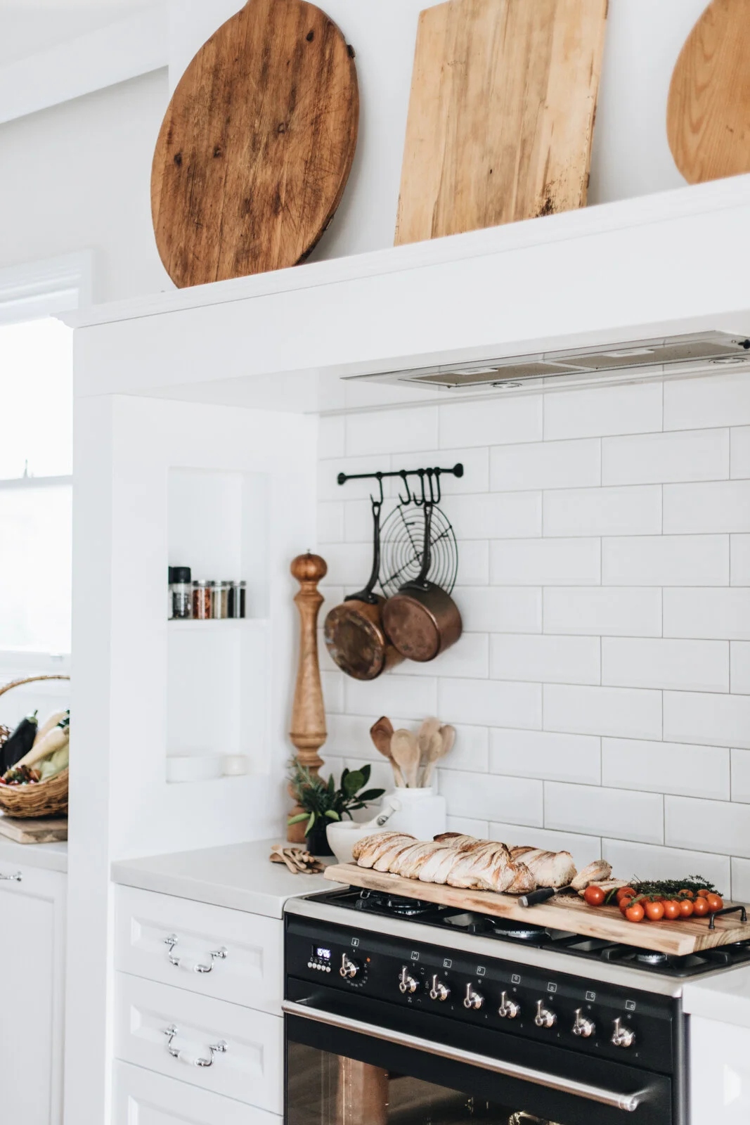
The design is a modern twist based on 1850’s style kitchens where the large oven and chimney surround was the focus and main function of the space. Ours is not only home to our oven, it also has little storage nooks, as well as being in scale to balance with the exposed brick fireplace at the other end of the room.
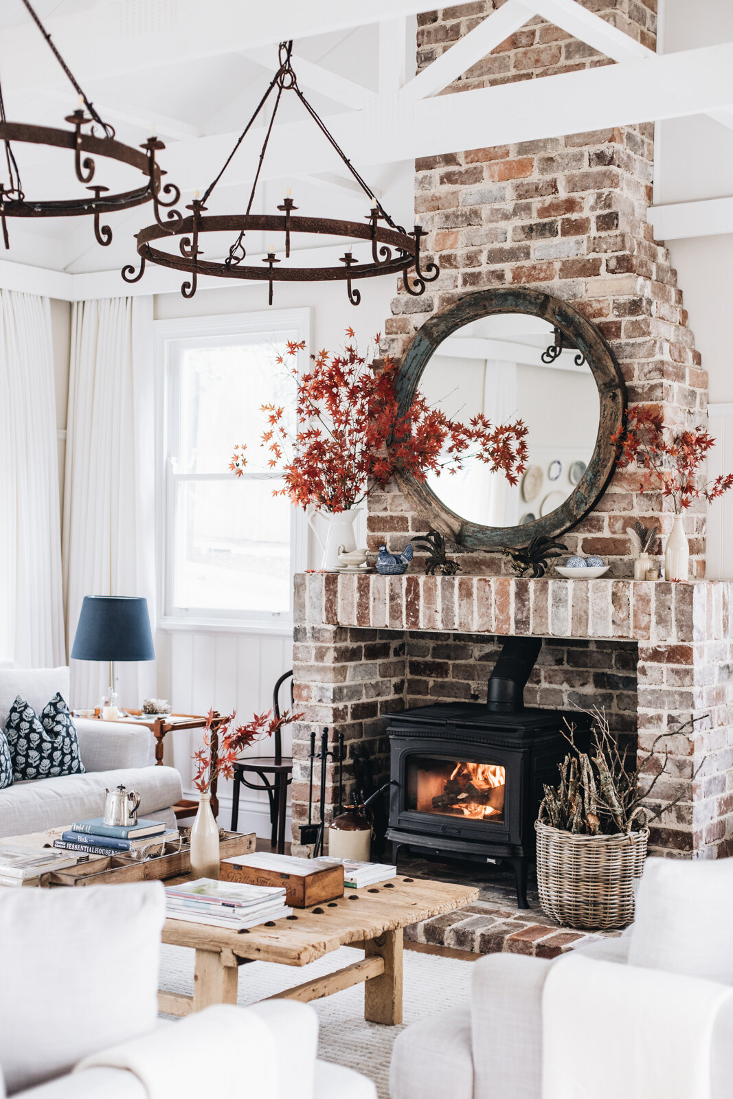
We kept the colours light but the details strong in this design, mostly due to the fact that it is so big, there was no need to do anything bold, we were after a well balanced room. The beauty is in the details absolutely.
We hand picked 100 year old recycled Oregon ceiling joists from a timber yard in Moss Vale and custom made our huge 3.5m long dining table. The kitchen island is made from these beams as well. We had largest single piece of Smart Stone delivered and made the supporting structure to fit. It looks simple but there’s so much that goes into the structure of this bench to hold the weight yet look effortlessly light, and it was all constructed in situ.
A light filled hallway works to connect the old and new parts of the house. It works as a grand entrance to the expansive new kitchen dining and living space.
Every element has been designed and made with careful consideration to harmonise with the rest of the building. The details of the ceiling trusses and how they integrate with the ceiling boards, timber sash window and custom sills, heritage wall panels and picture rails, traditional French doors with recessed panel details, panelled verandah ceilings with down lights, custom turned verandah posts, right down to the joint details in the verandah decking boards. The beauty of this build is in all the detail.
“There is so much detail designed into this home. The timber work is strong design element everywhere you look”
We added a separate studio space off the main house which is home to a luxury king bedroom and ensuite. A stunning light filled room with large french doors opening onto the view across grass paddock and creek. The exposed rafters and detailed timber in this room mirror the look we created in the new kitchen extension.
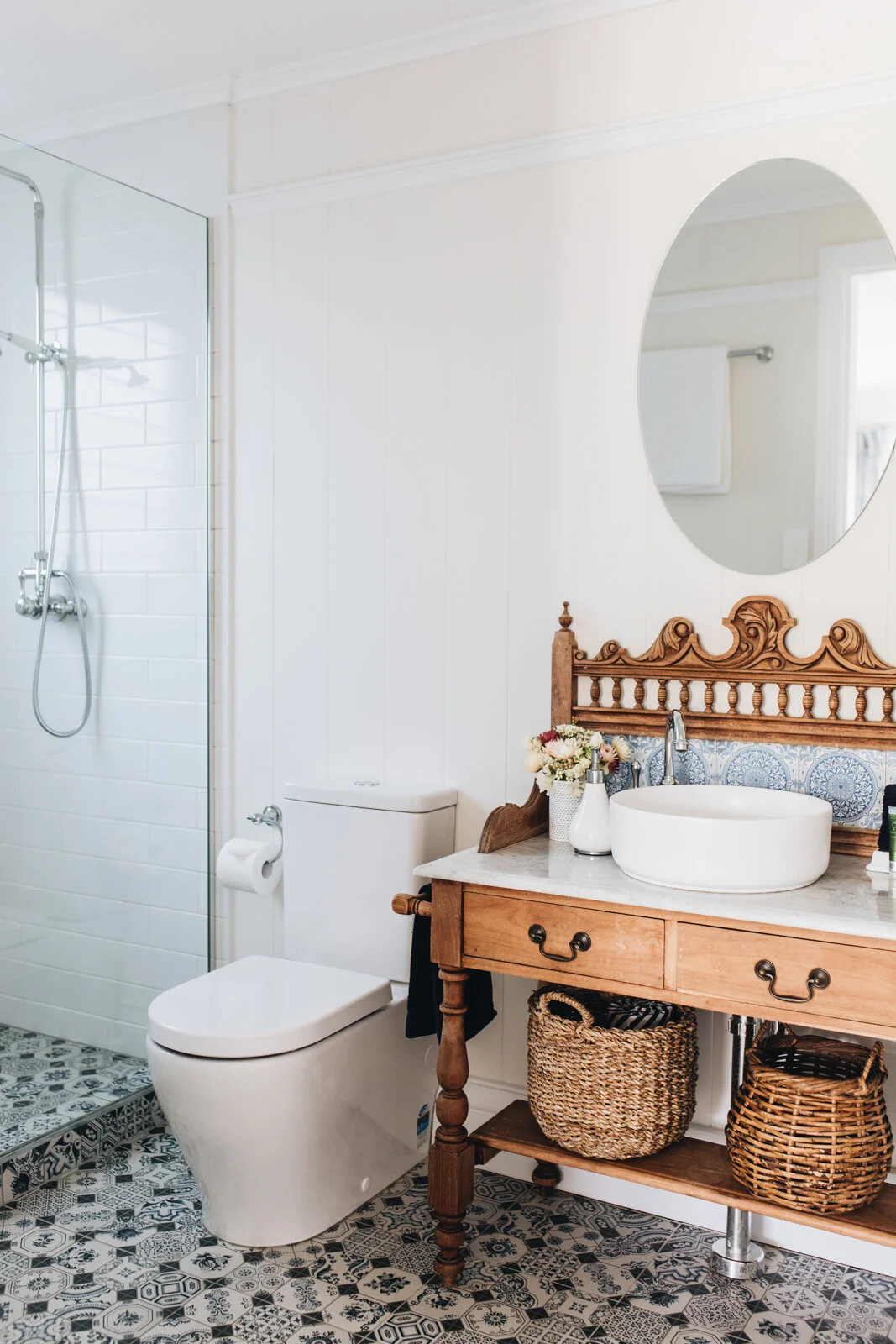
To bring a heritage feel to the new bathrooms we restored antique washstands and dressing tables and used as the vanities with traditional tap ware and surface mounted basins. Traditional heritage themed blue and white floor tiles carry on this theme.
The new bunk room is more than just a crowd pleaser for the kids, with generously sized king single beds, the room is designed for adults too. The beautifully detailed custom made bunks sit elegantly against the timber panelled walls. The detail in the room brings a lovely cosiness and warmth.
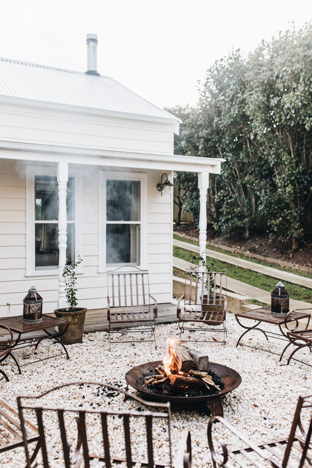
Many people walking past the house think the new extension is actually the old part of the house, and the old 2-story part of the house is the new part. We love this; it means the house is perfectly balanced. We did this by a very careful choice of materials. Instead of using flat cladding with no character we opted on rustic and character filled red cedar to match the texture of the old house, the knots and grain are very course and once painted matched perfectly with the existing building.
“It is hard to see the line of where new meets old”
The completed build
Before the renovation

